Introduction
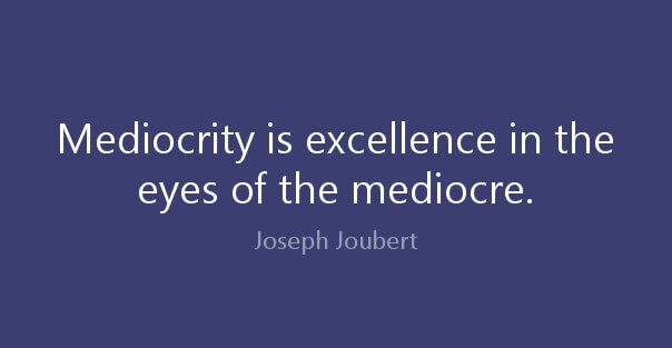
What singles out a good design from a mediocre one? Well, among many other things, there is one subtle difference that separates the good ones from the average ones and it’s the lack of understanding of the trends. A good web design company will definitely follow the latest trends but in appropriate places. It’s because they understand the meaning and significance of such implications. On the other hand, mediocre designers just follow the trends blindly without any clear understanding of the fashion – they take to the trend for the sole reason of it being "the trend" and often ends up with silly improper applications. The post below shares the top 8 aspects that spell "mediocre" design.
Frutiger/Futura/Helvetica on everything
When it comes to choosing the typefaces, Frutiger, Futura and Helvetica top the list with elan. Why? Well, they are supposedly safe solutions and hence you will usually find designers using them on everything. It’s a sheer sign of mediocrity because these fonts cannot convey all forms of expressions and some situations do demand experimentation with a different kind of font for the bespoke feel- and often mediocre designers are too lazy to experiment. Safe is "safe" but then again fonts carry this important responsibility to take the theme of the message to the next level that text can’t say. So, if your chosen font cannot express the desired aura of your site or presentation, its value immediately reduces to almost nothingness.
Too much focus on minimalism
Minimalism is always classy with its simplistic subtle outlook. But then, when you design something, you aim to convey a meaning or message- and your minimalist design will have no meaning if it's too simple to express the functionality of your product or presentation. It’s like designing a watch with just 2 hands without no marks for hours and minutes. Isn’t that too vague? Well, that’s definitely a sign of mediocrity you have to be aware of. You can any day use the minimalist approach but you must make sure to check beforehand that your particular situation is conducive to a simplistic feel.
Too many features
A feature-rich design is undoubtedly great but not so when there are too many needless features. Take the example of your microwave oven. How many buttons do you use every day? The Start button and the timer are used 99% of the time and later on, you realize you don’t need 60% of the buttons most of the time. Too many features only add to the complexity of the situation and the same goes with any design.
Mindless generic use of full-screen imagery
When it comes to picking the most embraced web design trends, full-screen imagery comes up with oodles of votes. No, no, it’s not anything bad but its excessive usage has made it just so boring. It pains to see websites mindlessly designed with generic full-screen imagery with no uniqueness of their own. Once again, there is no harm in incorporating full-screen imagery in a website but a good web design company in Kolkata is one that will make sure to zing it up with its own exclusive flavours.
Style over substance
Good looks sell and there is no denying the fact. No wonder, modern web design trends are putting emphasis on aesthetics as well along with the functional aspects of the site. But then, your presentation or website is mostly meant to convey some information or data to your niche and if the style overshadows substance, your presentation loses out on 90% of its value. A glossy pub flyer would have no significance if it doesn’t state the contact details or map properly. One of the major things that single out a good designer from an average one is that the former will always keep substance and functionality over style.
No user-concentric responsive behaviour
It’s a "smart" world today where 70% of the online audience takes to mobile for web browsing and hence it’s of utmost importance to ensure a mobile-friendly responsive design. There is nothing wrong with parallax scrolling but it can’t be implemented in your design just like that as many mediocre designers do. While implementing the responsive design, you have to ensure that your design is structured in tune with human behaviour. Responsive design with no sensibility of user experience only confuses the situation and can even make the visitor leave your site halfway.
Generic Uniformity
Uniformity forms the basis of most of the designs given its simplicity that in turn assures a standardized and convenient use. But then, what mediocre designers don’t keep in mind is that one single solution cannot be the answer to all problems. It’s the age of heavy mass customization today and the contemporary audience expects custom-fit designs mostly. So, if you want to transcend from an average to a good designer, check out your audience preferences first before applying the “uniformity” phenomenon to your design.
Winding up
It’s great to follow the latest trends but when you are looking to set your footprint as a good designer, you should also focus on relevance and application.
Next PostPrevious Post