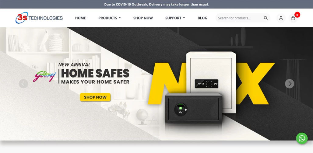
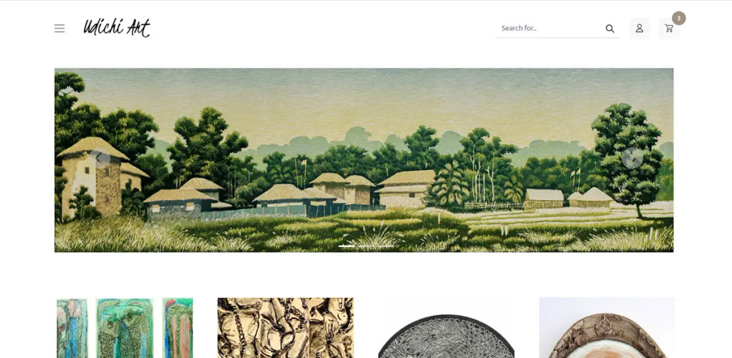
It is impossible to exaggerate the significance of a well-designed call-to-action (CTA) button in the constantly changing world of online design. These minute yet potent components act as potent catalysts, boosting user interaction, conversion rates, and, ultimately, the success of your website. We will examine the art and science of producing compelling CTA buttons in web design in this extensive article.
The role of CTA buttons
- Defining CTAs: CTA buttons are items that are put strategically on a website to encourage visitors to perform certain activities, such as downloading a resource, signing up for a newsletter, or making a purchase. Their main objective is to direct and motivate visitors to conversion goals.
- Why CTAs matter: CTA buttons are the bridge between your website's content and your business objectives. They help users navigate through your site, making their journey smoother and more purposeful. Effective CTAs can significantly impact your website's success by increasing conversion rates and user engagement.
Key principles of effective CTAs
- Clarity and simplicity: CTAs ought to be unambiguous and simple. Make sure your messaging is clear and focused on the user's next move so they know what to expect when they click the button. "Sign Up," "Buy Now," or "Learn More" are good phrases to use.
- Visually standout: CTAs should be unambiguous and simple. Make sure your messaging is clear and focused on the user's next move so they know what to expect when they click the button. "Sign Up," "Buy Now," or "Learn More" are good phrases to use.
- Compelling copy: Write persuading text that speaks to the user's emotions or solves their problems. To convey a sense of urgency or excitement, use strong adjectives and action verbs. Try out various wordings to see which one your audience responds to the most.
- Consistency: Keep your website's design elements, such as CTAs' color, size, and location, consistent. It reinforces the importance of these elements by making them simple for users to recognize and interact with.
Designing engaging CTA buttons
- Color psychology: Different hues color psychology elicit different sentiments and reactions. For your CTAs, use a color palette that complements your brand and sends the desired message. For instance, red might denote urgency while green might stand for growth or enthusiasm.
- Button shape: Consider the shape of your CTA buttons. Rounded edges convey a sense of friendliness, while sharp angles create a more assertive impression. Experiment with shapes to match your brand's personality.
- Size matters: The size of your CTA buttons should be proportional to their importance. Primary CTAs should be larger and more prominent, while secondary actions can be smaller and less conspicuous.
- Hover effects: Incorporate subtle hover effects to make your buttons interactive and inviting. Changing the button's color or adding a shadow when hovered over can draw attention and encourage clicks.
Placement and context
- Above the fold: Place important CTAs above the fold, ensuring they are visible without scrolling. It is crucial for capturing users' attention immediately.
- Scannable content: Use headings, bullet points, and concise paragraphs to make your content scannable. It helps users quickly understand the value of your offer and encourages them to take action through CTAs.
- Relevant context: Tailor your CTAs to the context of the page. A CTA on a blog post may encourage readers to subscribe to your newsletter, while a product page's CTA should guide users toward making a purchase.
A/B testing and optimization
- A/B Testing: Regularly conduct A/B tests to evaluate different CTA variations. Experiment with colors, copy, placement, and design to determine which combinations yield the best results.
- Analytics and Feedback: Utilise web analytics tools to monitor the effectiveness of your CTAs. Pay close attention to user behaviour, click-through rates, and conversion rates. Obtain user feedback to pinpoint problems and potential improvements.
Mobile responsiveness
Mobile-friendly CTAs: Make sure your CTAs are mobile-responsive in today's mobile-first era. For touch screens, buttons should be the proper size, and text on smaller devices should still be readable.
Accessibility
Inclusive design: Consider accessibility when creating CTAs. Make sure that you can navigate them with keyboard shortcuts and provide the button pictures with relevant alt text. To make the text easier to read, keep the color contrast strong.
Final thoughts
Both art and science go into creating compelling CTA buttons. Deep audience comprehension, thoughtful design decisions, and ongoing optimization are the foundations of effective CTAs. The success of your website as a whole can be improved by creating appealing CTAs that direct people towards conversion by using the guidelines and techniques provided in this tutorial.
Remember that web design is a field that is continuously evolving, and being current with new trends and ideas can help you keep your CTAs relevant and effective in the dynamic world of online advertising. When you leverage the persuasive power of well-written CTAs, your website will flourish as engagement and conversions increase.
As a web design company based in Kolkata, our expertise lies in creating visually appealing and functional websites, as well as developing web applications tailored to meet your specific business needs. Our primary objective is to provide effective solutions that enable you to reach your business objectives successfully. With our dedicated team of professionals, we are committed to delivering high-quality website design and development services that align with your goals and contribute to your overall success.
Next PostPrevious Post