When it comes to designing a website, a good lot of thought goes into the homepage but usually, most people forget about the contact page. But what they don’t realize is that it’s the contact page through which your potential target would be reaching you- and if it’s not feasible enough, you would be losing out on the conversion of potential audience to actual customers big time. Thus, a smooth contact page is really important when you are serious about a user-friendly website.
It’s a major point because almost any website out there- be it an online store or a news site or a corporate platform- every web platform sport a contact page.
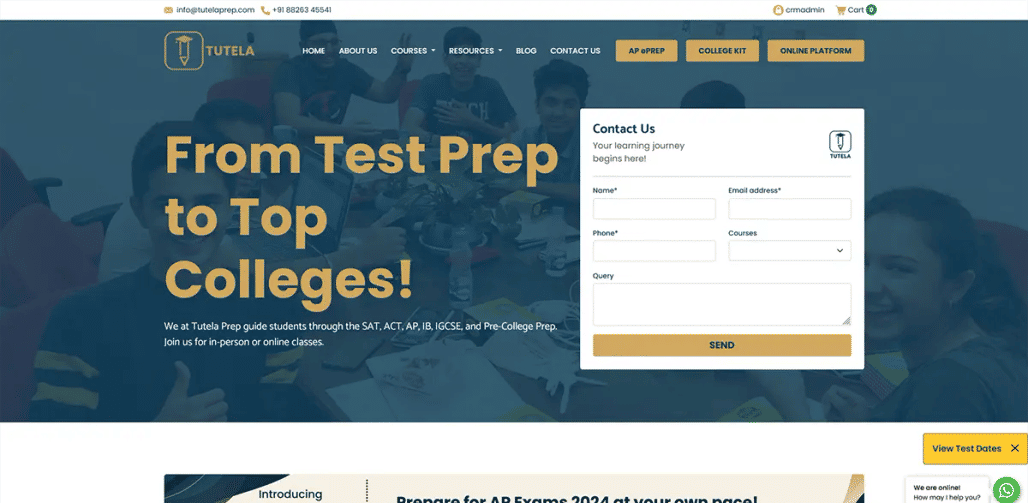
The essence of a robust contact page
Just put yourself in the shoes of a visitor- you are eager to get in touch with a website owner or the customer care team of the site. You are frantically searching for the route to communicate with the company but you can not find a suitable or legible way. At times, you can feel that the desired information could be there yet it seems to be “hidden”. In fact, sometimes, finding a basic phone number means wading through a series of unwanted automated messages.
Now, this is something strictly not done. Websites that are not exactly mindful of a convenient contact page are only testing the patience of their visitors who would soon get frustrated and head to your contenders. You should understand that a good contact page is not only just about the information on how to contact the site owner for queries. It’s also about maintaining an interactive ambience where the visitor will feel at ease to communicate with the company. If you cannot make your visitors feel comfortable at your site, you cannot expect sizeable conversions.
Besides, an interesting contact page plays a great role in influencing the customer’s impression regarding your brand overall. It provides them with a reliable surround for discussion, offering feedback & also stating complaints. This very freedom is crucial to ensure happy users as it emits a sense of being heard & appreciated.
Points that make a cool contact page
Good functionality is primary
Functionality is always the prime key and it goes the same with your contact page. You might be thinking that your contact page looks perfectly normal- but have a look again- there could be major points that you are missing out on. Check out for crowded pages and broken links and make sure to address them fast as they are really harmful to your business. Such issues might imply incorrect data to users or a skip on vital messages and you know how much damaging these could be for user experience.
Location is crucial
Easy accessibility of your contact page is very important. Yes, you might have spent hours preparing a highly refined page but all such hard work would be completely meaningless if your users cannot find the page in the first place. It’s better if you can offer instructions on finding the page.
Usually, designers position the contact data in 2 places-
- Primary navigation-you have to make sure that the users get a link to your contact page as they land on your site. Studies show that it’s the common tendency to look right when somebody lands on a website and hence you can place your contact page link there.
- Sub-navigation-You can have a small yet legible link on the top right side of your page. However, never put the link in the drop-down menu as it would get overlooked most of the time.
Awesome design
Contact pages are not much about high-end graphic designing as you do with the homepage- but you should make sure that the overall design of the page is in perfect sync with that of the gorgeous get-up of the overall website. Proper visuals & functionality are crucial here.
Shorten contact forms
It’s a busy world today and you’re your visitors are not likely to spend their entire time on your contact form. If the form is too lengthy, they will just look elsewhere. So, go for compact forms with only the basic questions.
Don’t forget the Google Maps
If you want your online visitors to meet you upright in your brick-and-mortar store, always provide a map directly on the contact page. It also makes your business look even more credible.
Responsiveness is vital today
With the online world steadily getting ruled by smartphones and tablets, you have to ensure a responsive contact page- something that looks equally smooth on all browsing devices- regardless of the size of the device.
What goes inside?
Email address and/or contact form
There are usually debates on whether to include a contact form or email id on a contact page. Let’s have a look at the best parts of both.
Contact form:
- Users won’t be needed to switch between the pages
- Users won’t have to waste time creating accounts or logging in with their email id
- Helps with the autofill function
- Can send emails and notifications
Email address:
- Assures the safety of visitors
- Will save the email that can be used later
- Copy the sent message & make it accessible
You can use both actually to duly cater to all ranges of visitors on your site.
Importance of form validation
Form validation is significant in the sense that it will assure your visitor that their entered data have been submitted successfully. Besides, the validation will also help the users to get an alert when there is a mission field or wrongly typed information.
Telephone numbers
Phone numbers must be included as they help to establish the credibility quotient of your business and give your potential client a way to contact you immediately.
Social networking pages
It’s the age of social networking today and hence your contact page must include social media buttons. These are even more important if you are offering round-the-clock support through social media.
Designing your contact page
It demands robust technical know-how to design a contact page and visual styling is quite crucial here. For example, spacious fields on the contact form are much welcome as they look breezy, inspiring and friendly. Likewise, whiteness and padding are good enhancers.
It’s advised that you take to extensive research before you actually sit to design the layout from start. Your focus must be on diverse & well-organized elements. Go for mockups prior to the final draft.
To sum up, your contact page should be in proper alignment with your website’s visual scheme to ensure easy consistency. A harmonious consistency is much needed to keep the visitors focused and make them feel familiar with each page of your site.
Be simple, smart, easy and functional when it comes to your contact page.
Next PostPrevious Post