Introduction
Bootstrap, originally known as Twitter Blueprint, was developed by Mark Otto and Jacob Thornton of Twitter in 2011. It was renamed from Twitter Blueprint to Bootstrap, and released as an open-source project on August 19, 2011. Bootstrap methodically changed the hardships that web developers faced in rendering a web page in a consistent way across all devices and browsers. In fact, we at Hexadesigns stopped developing websites altogether during 2009 -2011 only because of the prevalent browser wars at that time. Separate CSS files for every browser had to be built and the cost of maintaining a project was not worth developing for. Bootstrap changed the game altogether. The term "responsive web design" came into existence when Bootstrap entered into ver 2 and nowadays it is a de-facto standard for any well-designed website.
So what is Bootstrap?
Bootstrap is a framework of HTML, CSS and JS that helps build responsive, mobile-first sites and applications. Developers can include Bootstrap files and select the components they wish to use in their web development project. The fun part is a lot of these components come as jQuery plugins and they can be used seamlessly with jQuery. For example, a bootstrap modal can be made to fade in to appear and fade out to disappear.
Bootstrap 1
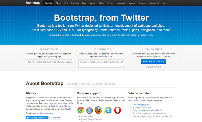
Bootstrap 1 was released in 2011 and it was not even responsive. It had gradients for it's elements. Well in 2011, gradients were hot!
Bootstrap 2

Bootstrap 2 was released as fully responsive (but optional), and at the same time, it stopped supporting Internet Explorer 7. This was probably the coolest thing for web developers to have in 2012. Gradients were still on. But well, life for web developers looked better now!
Bootstrap 3

Bootstrap 3 was released on Aug 19, 2013, and adopted a mobile-first design, thereby implementing responsive design by default. Glyphicons images that were used in ver 2.0 were now replaced with fonts. This also included 40 new Gulps. For a better future, Internet Explorer 7 support was dropped and Internet Explorer 8 support was phased out. Bootstrap 3 is really what we once dreamt of in 2009 - 2011. Gradients were dropped and a "Flat" trendy design was adopted. The grid system was made more powerful. We blasted a lot of projects with it and we still use Bootstrap 3 day in, and day out.
Bootstrap 4
Back in 2014, the announcement for Bootstrap 4 was made by Otto. 2 years later and after 1100 commits (as of date) with 120,000 lines of changes, Bootstrap 4 Alpha has been released. We are all excited as ever. Because this is the framework we love the most and we love to see it getting better and better at keeping pace with today's ever-changing technology.
What's New
Let's see what's new in Bootstrap 4 compared to ver 3.
First of all, Bootstrap 4 completely drops Internet Explorer 8 support. This means better CSS3 techniques can be applied as the front-end framework is no longer blocked by legacy browsers. However, the framework still supports Internet Explorer 9.
1. SASS in LESS out
In all previous versions, Bootstrap used LESS as its main preprocessor. In version 3 a SASS port was created but still, it was LESS all the way. Bootstrap 4 uses SASS and not even a LESS port exists(!). This means Bootstrap now compiles even faster with LIBSASS.
2. Improved Grid System
A new grid tier has been added to better target mobile devices and at the same time, the semantic mixins are completely overhauled.
3. Flexbox - the future
Switch a boolean variable and recompile the CSS to take advantage of a flexbox-based grid system and components.
4. Enter Cards exit Wells, Thumbnails, Panels
Cards are the new cool component on Bootstrap 4 and can do everything that Wells, Thumbnails and Panels did. Only a tad better.
5. IE8 support dropped and pixels eliminated
No more CSS hacks and fallbacks as support for IE8 has been dropped. Pixels have been replaced by rems and ems where appropriate, to make responsive typography and component sizing even easier.
6. All JavaScript plugins re-written
All Javascript plugins have been rewritten in ES6 to take advantage of UMD support, generic teardown methods, option type checking, and tons more.
7. Improved auto-placement
Tooltips and popover auto-placements have been greatly improved with the help of a library called Tether.
And a lot more...
Conclusion
Well, it just gets better and better. It is almost impossible to imagine web designing and web development without Bootstrap, in today's world of mobile phones and varied devices and screens. We at Hexadesigns will wait for the final release of Bootstrap 4 before we actually start using it in one of our projects.
We take a bow Otto and the entire team for this immense framework and for making our lives easier.
Hexadesigns is a web design company located in Kolkata, India. We take advantage of the latest trend and technologies to design, redesign and develop websites. This is our blog where we publish information for the general people and web developers for their knowledge enhancement.
Next PostPrevious Post
