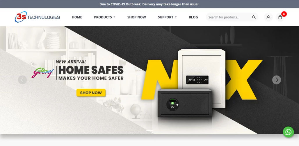
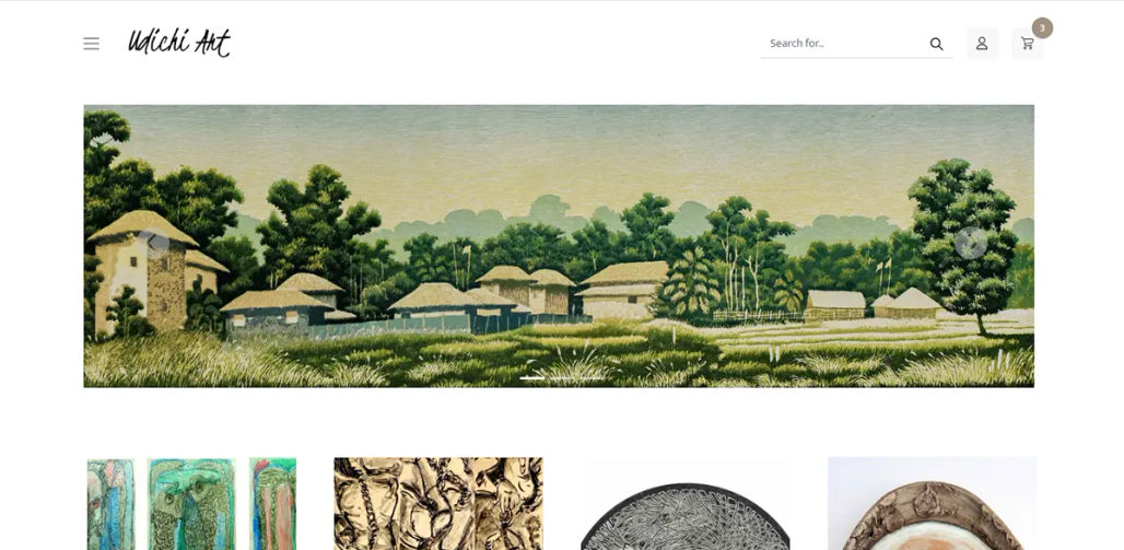
Screen layout, transitions, and interface animations are only a few of the enormous, visually appealing visualizations that contribute significantly to the evolution of UI design.
Every website aims to communicate to its visitors the mission and enthusiasm of the company, and in the digital age, typography is the most straightforward way to do that.
Ninety-five percent of a website's design is made up of font. The typographical layout's hierarchy, appropriate text length and size, and font selection are just a few of the elements that aid in directing people through the website.
Typography affects how consumers read and comprehend the material on a website. Because of this, recognizing its importance and implementing the suggested strategies are among the simplest ways to differentiate yourself from the competition and provide your clients with an improved online experience.
This piece explores the various aspects of typography in web design, including how it affects branding, readability, user experience, and the newest trends and best practices.
Overview of typography in website design
Typography is the art and practice of placing type in a way that, when displayed, makes written language understandable, readable, and visually beautiful. It entails carefully choosing typefaces, point sizes, line lengths, leading and trailing line and letter spacing, and kerning—carefully modifying the space between letters.
Typography in web design refers to the harmonious visual experience that directs the user's interaction and enriches the content rather than just selecting a font. A website with well-chosen typography might appear professional, reliable, and captivating, whereas a poorly chosen typography may appear unprofessional and challenging.
The fundamentals of typography
1. Fonts and typefaces
- Typefaces like Arial, Times New Roman, or Helvetica are the designs used for letters. Every font has its personality and expresses a range of feelings.
- The digital files called fonts show the typeface in different sizes and styles. One font is Arial Bold 16pt, for instance.
2. Serif vs. sans-serif
- In serif fonts, a letter or symbol's bigger stroke is sometimes accompanied by smaller lines or strokes. Frequently utilized in print media, they are seen as more conventional.
- Sans-serif fonts are suggested for web design because they appear well on low-resolution devices and are more straightforward and casual than serif fonts. Both are frequently utilized for body material and headers (including titles, logos, and so forth).
3. Display and script fonts
- Display typefaces are ornamental and intended for brief textual bursts like headlines. They are visually striking, but in big quantities, they can be overwhelming.
- Script typefaces are used to add a sense of elegance or originality and are designed to resemble cursive handwriting.
4. Leading, kerning, and tracking
- Top readability can be attained with optimal spacing and alignment. Proper alignment creates a professional appearance, and well-placed lines make text easier to read. Justified texts can occasionally be more challenging to read, particularly on small displays. Therefore, we must assess how readable the various alignments are.
- The modification of spacing between individual letter pairs is known as kerneling. For best readability, letters must be visually spaced, which is ensured by proper kerning.
- Monitoring On the web, tracking, or letter-spacing is the spacing between letters inside a word or phrase. More space is provided for the letters that make up a word with bigger tracking.
The impact of typography on readability
The ease with which a reader can comprehend written material is readability. Because consumers scan web pages rapidly and need to discover information quickly, readability is important in web design.
1. Font dimensions and arrangement
The text's size is a major consideration. A larger, bolder header font should draw the eye and direct readers through the content. A seamless flow of information is ensured with smaller body text and subheadings. A well-structured hierarchy improves readability and facilitates content organization, resulting in a user-friendly website.
2. Length of line
Generally speaking, a line should have between 50 and 75 characters. Too small or lengthy lines might cause eye strain and hinder comprehension.
3. Line elevation
Sufficient line height enhances legibility by ensuring sufficient distance between text lines. Setting the line height at 1.5 times the font size is typical.
4. Contrast
Website users may need help with consistent typography. To create typographic consistency, web designers must apply all of the previously described good website design standards to each typographic element. In another way, they should utilize the same typefaces, font styles, and other typographic components throughout the design.
Using a small selection of fonts is another aspect of this.
- Employing identical font styles for comparable elements
- Using standardized font weights and sizes
- Making use of constant character spacing and line heights
Fonts and user interface (UX)
User experience aims to provide users with a smooth, simple, and joyful interaction. Typography is crucial because it affects how consumers perceive and engage with content.
1. Diagrammatic hierarchy
Typographic hierarchy is a technique that shows people where to focus and how to discover information by arranging typefaces and fonts in a layout in a certain sequence. It makes it easier for the user to decide which text should be ignored and which is the most relevant.
2. Regularity
Ensure that the website's typography is consistent from start to finish. Ensure that fonts, sizes, spacing, and other typographic components are used consistently throughout all pages to create a cohesive and expert appearance.
3. Availability
All users, including those with visual impairments, can read and comprehend material thanks to the accessible font. It entails offering text scaling options, readable fonts, suitable sizes, and adequate contrast.
4. Adaptability
Text that adapts to different screen sizes and resolutions is called responsive text. The text needs to be readable on small smartphone screens and huge desktop monitors, making it crucial in the age of mobile browsing.
Fonts and Logos
A brand's identity can be established and strengthened with the help of typography. It uses typefaces and how they are used to communicate the personality and values of the business.
1. Choose your typeface
Selecting the ideal font is essential for branding. For instance, a computer business may use a contemporary sans-serif typeface to seem inventive and cutting-edge. In contrast, a law practice may use a classic serif font to communicate professionalism and dependability.
2. Personal fonts
Many brands use custom typefaces to establish their own identity. It is possible to create custom fonts, especially to match the aesthetic and philosophy of a business.
3. Typography and logo
A company's logo frequently features typography as a major element. The typeface, letter spacing, and alignment choices can greatly impact the effectiveness and recognition of the logo.
4. Uniform utilization in all media
Maintaining a consistent font style throughout print materials, commercials, and websites helps to create a cohesive brand presence and improves brand identification.
Web typography Trends
The evolution of web typography is in constant motion due to technological and design developments. Keeping up with current trends can assist designers in producing cutting-edge, captivating websites.
1. Changeable fonts
Users need help reading a page with a lot of fonts. Many user interface designers advise using no more than two fonts on a webpage or application and instead altering the fonts' other characteristics to make them stand out. You can achieve this by adjusting the font's weight, colour, line height, spacing, and other factors.
2. Big, bold fonts
One trend that attracts attention and has a powerful visual effect is using bold, big fonts for headings and important messaging.
3. Unique and fencilled fonts
Remember that serifs can be difficult to read at small sizes when choosing a typeface. For tiny text, use sans-serif fonts to improve readability and understanding. Italic styles should also be avoided for small text because they can make it less readable.
4. Simple typography
With a focus on clarity and simplicity, minimalist typography frequently uses crisp sans-serif fonts, lots of white space, and subdued color schemes.
5. Dynamic typography
Animated typography draws visitors in and boosts interaction by bringing an interactive aspect to site design. However, it should only be used sparingly to avoid overwhelming the user.
The best font practices for the web
When best practices are implemented, typography improves a website's overall design and user experience.
1. Place readability initially
Choose readable fonts and sizes, adhere to the optimal line length and height, and ensure sufficient contrast between the text and background.
2. Create an explicit hierarchy
It uses font size, weight, and style to establish a logical and straightforward visual hierarchy that leads readers through the material.
3. Retain uniformity
Maintain a unified and expert appearance across the website by using the same fonts, sizes, and spacing.
4. Optimize for performance:
Variable fonts help decrease load times and improve responsiveness. Web-safe fonts should be used, and performance should be considered when loading custom fonts.
5. Make sure it's accessible
Make material accessible to all users by utilizing accessible typography techniques, such as offering text scaling options and ensuring enough contrast.
6. Examine various devices
Test the font on multiple screens and devices to ensure it is readable and responsive. It involves examining font rendering problems across several browsers.
7. Keep up with the trends
Keep an eye on the most recent typographic trends and carefully incorporate them into your designs to maintain a contemporary and captivating website.
Conclusion
Typography is crucial in web design because it impacts user experience, readability, and branding. Designers may create websites that are not only aesthetically pleasing but also useful and user-friendly by grasping the principles of typography and putting best practices into reality. Keeping up with the latest developments and trends in typography will be essential to producing successful and engaging digital experiences as web design changes.
In conclusion, it is impossible to exaggerate the importance of typography in web design. It is a potent instrument that, when utilized skillfully, improves the presentation and perception of content, thereby boosting a website's success.
We provide website design and development, e-commerce development, mobile app development, and premium web hosting tailored to meet the diverse needs of businesses in today's competitive landscape. We recognize the pivotal role of an exceptional website and are committed to delivering tailored solutions to ensure your online success—partner with us to elevate your online presence and grow your business in the digital age.
Next PostPrevious Post
