Introduction
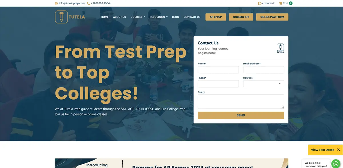
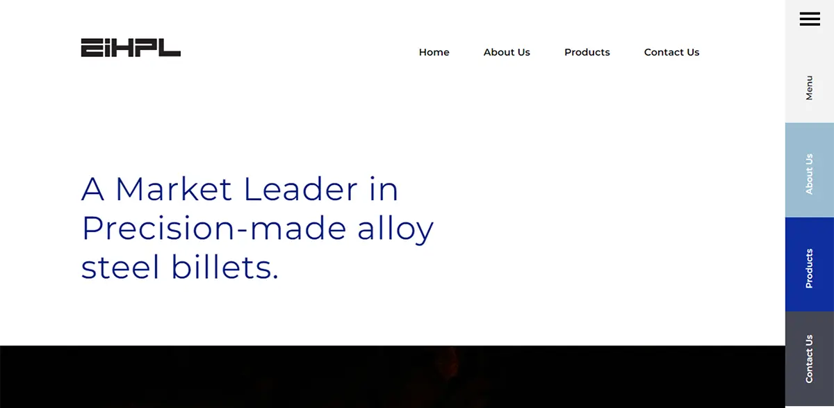
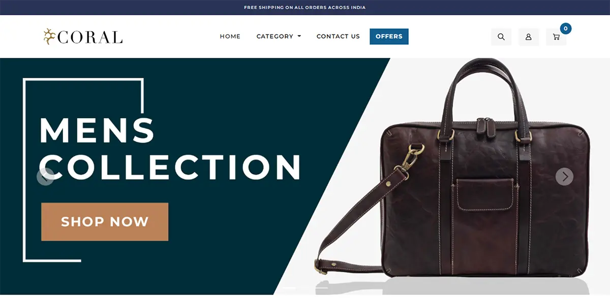
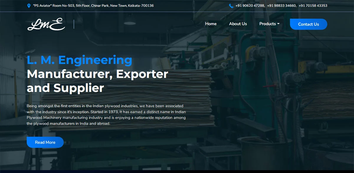
"Intuitive UI" is the talk of the town today when the whole world is getting more and more complex and we are wishing for things simpler and simpler. In fact, an intuitive user interface goes a long way to deciding the success or failure of your site and no wonder it’s one of the most buzzing topics among designers. In simple words, “Intuitive UI” refers to a user interface which is a breeze to understand without the need for any advanced assistance, experimentation, special training or elaborate reason. No matter how appealing or information-rich your website is, if it cannot assure a smooth and convenient UI navigability, your visitors are soon to look past. For example, when you have something looking like a pen, you always know that the moment you open the cap, you will have a nib to write. Just like that, when there’s a link, you know that as you click on it, it would take you to a site or a web page. These are the specimens of Intuitive UI- something where we know what to do for what or where our actions with it would lead us to. But then, if you chance upon a UI that’s not just tough to navigate yet also holds triggers unfamiliar to you, then you have the example of a non-intuitive user interface. For example, say you have got the latest smartphone model. But if it takes too long for you to figure out how to operate it, how would you enjoy its cutting-edge features that you were so passionate about? You might end up with your old phone once again. So, basically, a non-intuitive interface design obstructs your focus by taking you to some unfamiliar situation that has no such obvious hint. But, an intuitive design assures a seamless non-interruptive experience where you can fully enjoy the functionality of a website, mobile or any such stuff.
Below are the top 5 tips to assure an Intuitive User Interface with your web design-
Don’t change patterns
The human mind is accustomed to patterns and looks for those in similar things. Any change in common patterns could mean huge confusion for them, leading to a dissatisfying user experience and they would soon be leaving your platform. For example, the Windows user, who is so used to having the Minimize, Close & Maximize buttons on the right side of the window, will get a little bewildered when he shifts to the OS X – as it has got all those buttons on the opposite side.
So, do not attempt to change the familiar patterns in your web design, as much as possible. Keep main navigation either on top or on left, instead of going creative and keeping it elsewhere.
Streamline the process
It’s a busy world today where people are not going to give more than 20 seconds to a task on your website. Anything taking too long will be dubbed as “daunting” and your visitors might leave your site soon for platforms that assure quicker tasks. Thus, when you are stressing about improved intuitive UI, you must take steps to streamline or minimize the level of effort required by your visitors for a certain task on your site. It’s especially true when it comes to the registration or signup process. Keep the process simple and avoid excessive use of client-side data checking. Avoid unnecessary fields too.
Consistency is important
When a person visits your website homepage, he will soon develop an idea of how the platform is going to work. But if you tend to follow a different pattern with individual web pages, he will only end up being confused and frustrated. For example, if you have kept the navigation bar on top of your homepage, don’t change that format with the other pages. Otherwise, it would only lead to useless distractions which might drive your visitor away.
Tooltips and help messages
We all differ in perceptions hence what’s intuitive for you could be non-intuitive for others. Actually, it’s very tough to come up with a completely universal UI. But then, you can somehow get a backup if you are worried about the diverse perceptions. The best solution here is to include tooltips as well as help messages on your website so that even if the user is confused about a certain section or step, he will always know that you have kept assistance handy. It’s time-saving and also guarantees a more pleasant user experience.
Focus on fast loading website
As mentioned earlier in this article about good web design, people are busy these days and if your site takes too much time to load, they will get bored and leave. So, make sure your web pages are faster to load. In regards to the heavy pages, the smarter thing is to display the content partially to keep the users engaged with your site. Or use a loader animation to let know the visitor that the website is loading.
Conclusion
User experience is not just about visual appeal. In fact, it’s how you are making the visitor feel about the whole platform. Needless to mention, you have to be really smooth here or you might lose business. Thus, it is always recommended to hire a good web design company like us that can understand your business profile and deliver a clean precise website with an intuitive UI.
Hexadesigns is a web design company in Kolkata. We design and develop websites, custom software, eCommerce, and mobile apps and do search engine optimization. This is our own blog where we provide potential tips for the common people just from our experience of over 15 years.
Next PostPrevious Post


